Hey there, Looker Studio fans!
Looker Studio has some of the more advanced visualizations that people are looking for to analyze bigger datasets, larger date ranges & reference other data quickly.
We’ve been hard at work testing the great new features that will make your data visualization experience even better with Looker Studio.
View the report with charts I reference here -> https://lookerstudio.google.com/reporting/c5c7740e-8b73-4d31-b68a-f1acbc412050/page/p_0ob53a6o8c
New Chart Types Added to default Looker Studio Archive
The theme of these three chart types; Box Plot, Candle Stick & Waterfall Charts is that you will have to prep data specifically for these chart types. It’s not as easy as it used to be to just “Hit go”
Boxplot
This chart can be used to analyze the distribution of data, such as customer satisfaction scores, website traffic, or weather.
This can help identify areas where the data is concentrated, as well as outliers that may warrant further investigation.
Example, a marketing team could use a box plot to analyze the distribution of customer satisfaction scores for their product. Out liers, Mean, 1st & third quartile are very easy to gain at a glance over time.
This could help them identify areas where customer satisfaction is low and to target their marketing efforts accordingly.
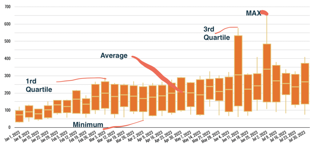
The hardest thing you will need to understand is Your Data Needs to look like this! 5 Metrics & 1 Dimensions. You will need to prep the data before connecting it to looker studio
- Dimension = Date
- Metric 1 = Maximum
- Metric 2 = 3rd Quartile
- Metric 3 = Median
- Metric 4 = 1st Quartile
- Metric 5 = Minimum
Here is a quick example using Sessions
I have sessions by month over time, where you can see outliers, mean & quartiles trended during this time period, to do this I had to write a query from a summary table that did the calculations by week.
Sample Query ---- USE AT YOUR OWN DISCRESSION

WITH WeeklyData AS (
    -- Extract the start date of the week from the sessionDate and group data by this date
    SELECT
        DATE_TRUNC(sessionDate, WEEK) AS WeekStartDate, --Turns into week, feel free to change in to month
        ARRAY_AGG(sessions) AS sessionArray
    FROM YourTableName -- change this to be your table's name
    GROUP BY WeekStartDate
)
SELECT
    WeekStartDate,
    MIN(sessions) AS Min, --finds theminimum during this time
    APPROX_QUANTILES(sessions, 4)[OFFSET(1)] AS First_Quartile, -- first quartile
    ROUND(AVG(sessions), 2) AS Mean, -- average
    APPROX_QUANTILES(sessions, 4)[OFFSET(3)] AS Third_Quartile, -- third quartile
    MAX(sessions) AS Max --Maximum value
FROM (
    SELECT
        WeekStartDate,
        sessions
    FROM
        WeeklyData, UNNEST(sessionArray) AS sessions
)
GROUP BY WeekStartDate
ORDER BY WeekStartDate;
Candlestick
The Candlestick is very similar to box chart, It just references the previous metrics & dimensions in the chart, just not the mean!
Use the same query as above just remove the mean/avg
- Dimension = Date
- Metric 1 = Maximum
- Metric 2 = 3rd Quartile
- Metric 3 = 1st Quartile
- Metric 4 = Minimum
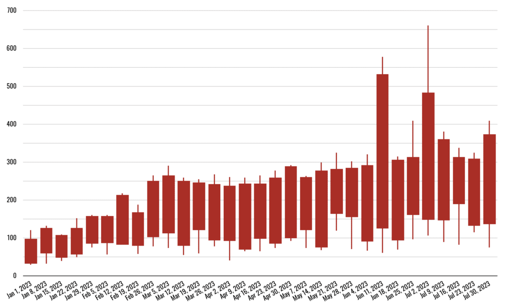
This chart can be used to visualize price movements over time, such as the stock market or the price of a product. This can help identify trends in the data and to make informed investment decisions or pricing decisions.
Example, a financial analyst could use a candlestick chart to visualize the price movements of a stock over time. This could help them identify trends in the stock market and to make informed investment decisions.
Waterfall Chart
A waterfall chart can be used to visualize the impact up or down of a series of events over time, such as sales & expenses. This can help understand how the events affected the company’s bottom line.
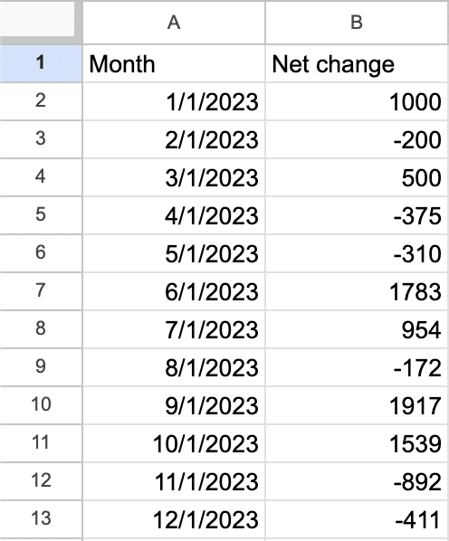
to do this you will need a chart which shows ONLY the deltas up or down vs the previous period.
Google’s documentation doesn’t help all that much.
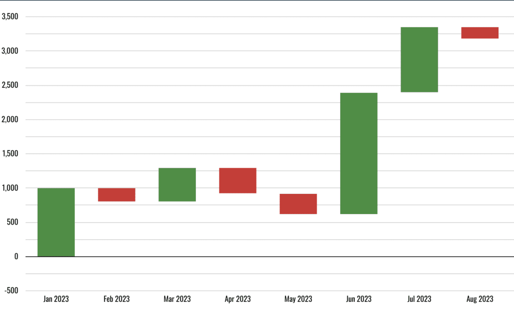
Here is the dataset I used for the above chart, it shows the change, but not the running total. Most data sets will have the volume, like Sessions for that month, not the net change which is why this can be complicated to do inside of Looker Studio.
It’s More Enterprise & Complex (which is good & bad)
These new chart types are more complex to use. Never before in the default charts has someone needed to ‘prep’ the data for visualization beyond the basics which would work for nearly any chart.
Now these charts you need to think if you would like to use them before you get into looker studio. On something like BigQuery or Sheets you will need to decide, is this worth it?
