


Mastering Search Engine Optimization is an incredibly daunting and, let’s be an honest, seemingly impossible task. The good news is that there are countless tools you can use to improve your SEO that are just a few clicks away.
Answer the Public is a wonderful online tool that allows you to discover exactly what people are asking and searching about different topics. It provides you with search insights directly from people on the internet. Their tool is incredibly helpful but can, at times, be a little overwhelming to navigate. We have some more good news for you! We have found a way to visualize the data in a way that is easier to digest and will make the path to data that much clearer.
Let’s hop right into it!
Psst… If you’re not a big reader, we’ve got you covered! Check out this video that outlines how to use this tool!
Navigating “Answer the Public”
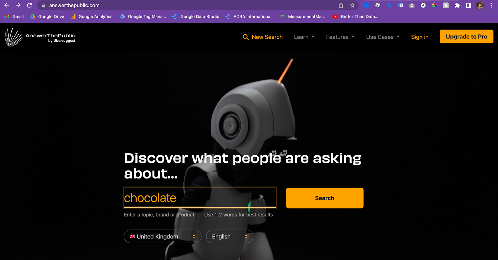
First off, you have to decide what topic you want to know what people are asking about. While working on this article, I was feeling a little hungry, so I decided to search “chocolate🍫,” but you can search literally anything your heart desires. Note: You are only able to do 2 searches per day, so use them wisely!
Once you click that search button, the website will generate a full report of the most popular searches that include your word or phrase. You are welcome to explore this auto-generated report as much as you’d like, but for the purposes of the article, we just need to download it.
At the top right corner of the screen, you will see a button that says, “Download CSV.” Click that bad boy!

Google Sheets
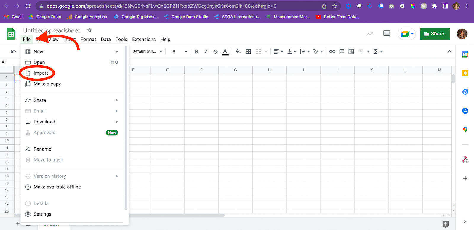
Once your CSV is downloaded, open a new google sheets document. In order to import the CSV, select file in the tool bar and search for the “Import” option.
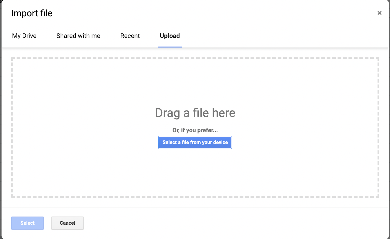
There are several options of ways to import, select “Upload” and drag and drop your CSV file onto the page.
When you import the file, there may be an extra row at the top of the sheet that serves as a kind of title. We won’t need this data, so you can delete that row and move the rest of the data up a row. By doing this, you place the categories in the first row, and this will make the transfer to Looker Studio much simpler.
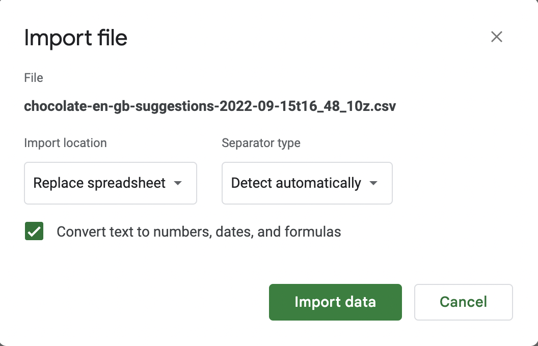
When you drop your file and select upload, a pop-up will come up that allows you to select settings for your data. Replicate the selections that you see in the image below.👇
Once you have imported your data, you are pretty much done in Google Sheets. Just give your document an easily recognizable title and save it!
Looker Studio
Connecting Your Data
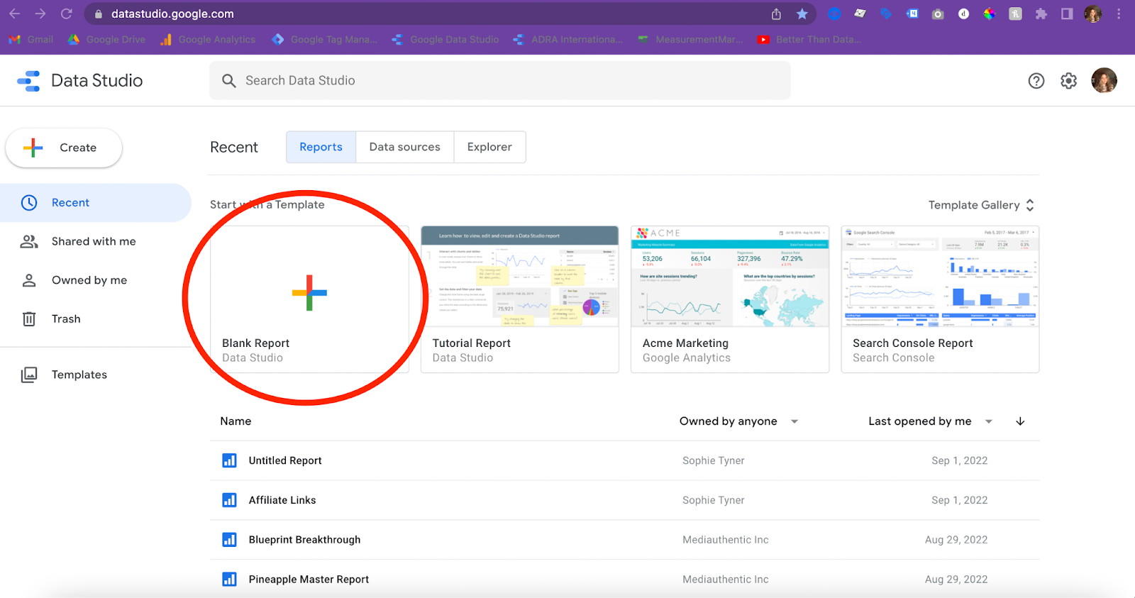
Next, we are going to head over to Looker Studio and begin creating our visualization. Open Looker Studio and select “Blank Report.”
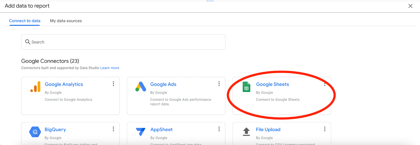
Once you have opened your new report, you will be prompted to add data to the report. Select Google Sheets and navigate to find the sheet we just created from the Answer the Public CSV.
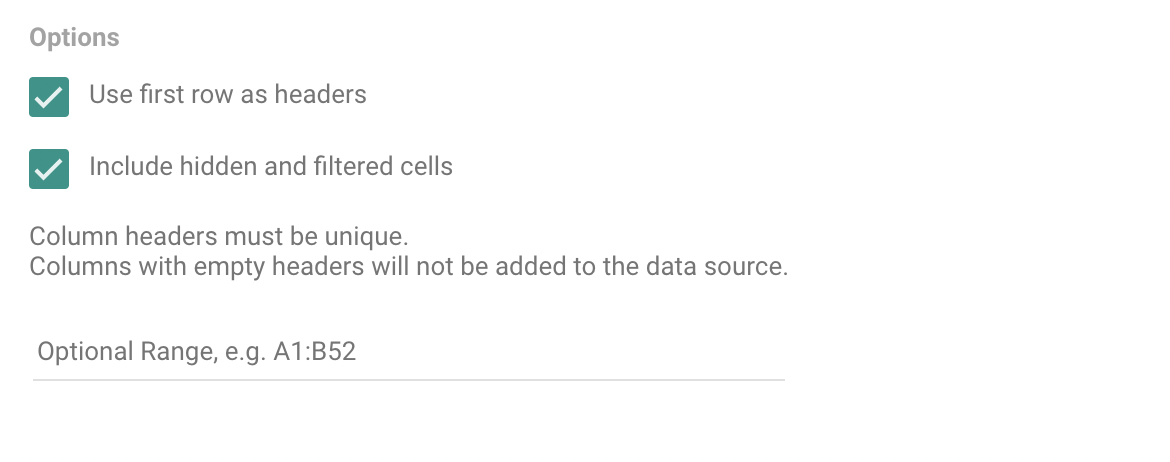
In “Options,” select “Use first row as headers” and “Include hidden and filtered cells.” This will turn the first row categories into usable dimensions in Looker Studio.
Congratulations, your sheet is now connected. You now have free range to create a multitude of charts, graphs, and tables to better visualize the data you’ve gathered. In this article, we will show you how to create a table that displays all the suggested searches and a filter to specify the different modifiers. We will also show you how to create a graph that shows which modifiers are most commonly used, as well as a table that places these modifiers in their respective categories.
Creating the Visualizations
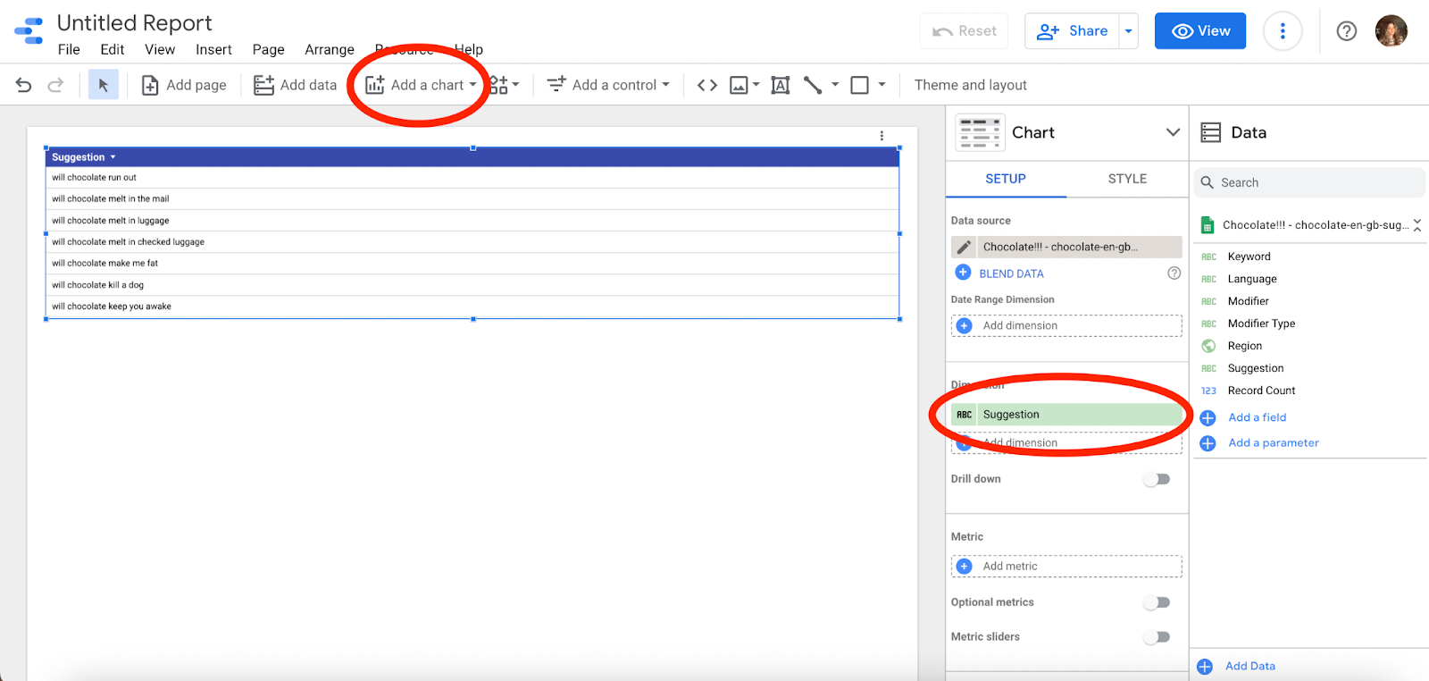
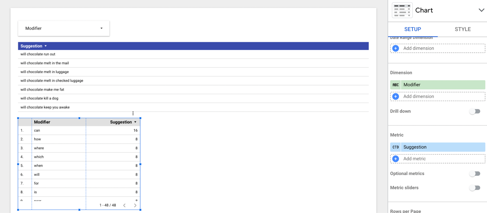
In order to get started, we will need to add a chart to our page so that we can input the desired dimensions and metrics. On the toolbar, select “Add a chart” and choose the table. In the setup tab, drag “Suggestion” from the Data section and place it in the space below “Dimension.” Once you have done this, you will have a chart that displays all of the most commonly searched phrases that include your topic.
At this point, you may also use the style tab to alter the design of your chart. You can change the font, colors, and edit other details of the table however you would like. I chose to make the header blue, but you can do whatever feels right for you.
Having all of the suggestions displayed in this way can be very helpful on its own, but adding a control will give you more control to see exactly the information that you want and is most helpful.
In the toolbar, select “Add a control” and choose “Drop-down list.”
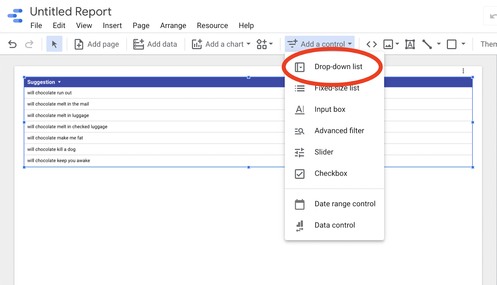
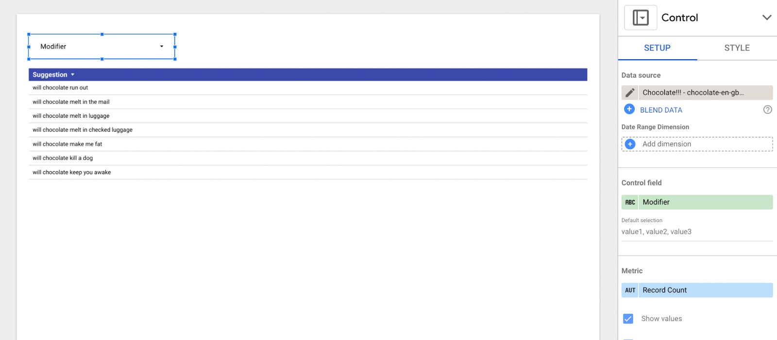
Grab the dimension entitled “Modifier” from the Data section and drag it under “Control Field” in the Setup section. It should look just like what you can see below.
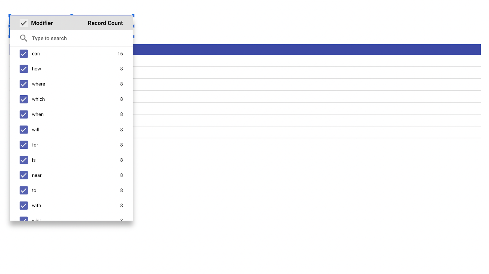
If you click on the control, it will open up a drop-down list that will allow you to select one, or as many modifiers as you would like to see in your suggestion table. This will filter the suggestions to show only those searches that contain the specific modifier.
For example, if I were to select the modifier “can,” only suggestions that include the word can will appear in my table.
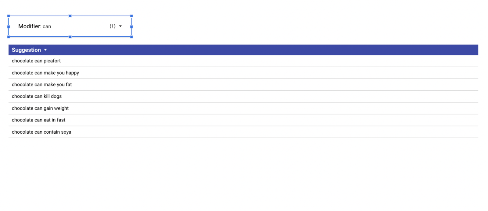
If you ask me, the answer to that second suggestion is a clear and resounding YES! 🍫😋😋
This tool on its own can be very helpful in understanding what people are searching for the most concerning your topic. If that is all you need, feel free to stop here. But, if you want a little more detailed information of specifically what words to use for SEO, we will show you another visualization that can help with that!
In order to do so, create another chart in the form of a table. Select “Modifier” for your dimension and place “Suggestion” under metric. While “Suggestion” normally functions as a dimension, using it as a metric will allow you to count the number of distinct suggestions for each modifier. Your table setup should look like this 👇.
Once you have correctly set up the table, click the down arrow next to “Chart” above the Setup and Style tabs. Select the bar chart.
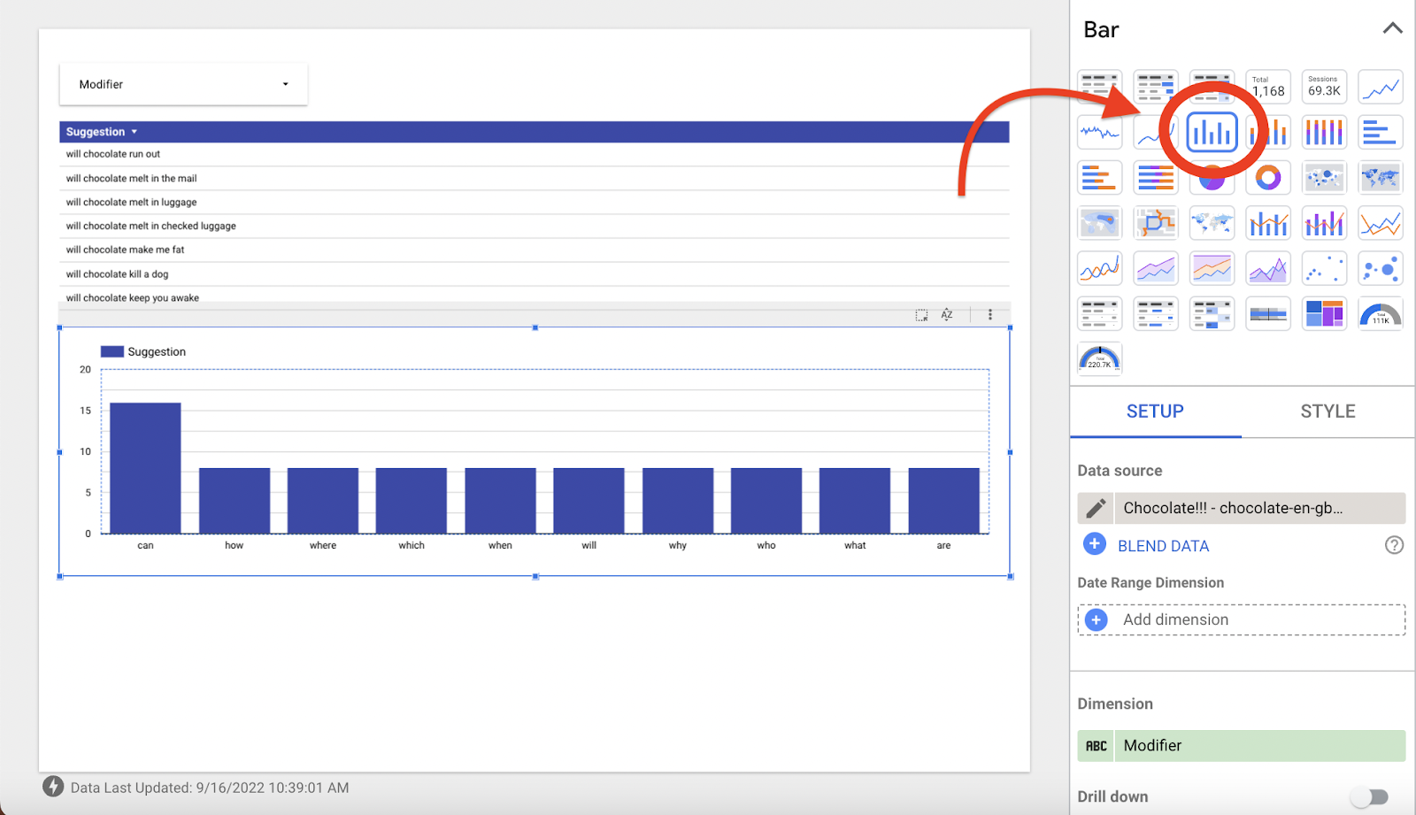
Once you have done this, you will be able to very clearly see which modifiers are most popularly used in searches concerning your topic of choice.
And that’s all, folks! You have successfully created your very own custom SEO research tool and visualization. With the use of these tools, it will become much clearer what users are wanting to know about your topic, and you will have a clearer understanding of what you need to do to make sure your pages are getting those clicks!
Happy searching! 😊


